
文章摘要
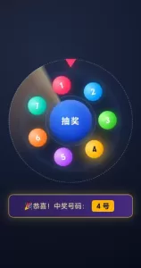
这是一份炫酷动画抽奖转盘源码,包含完整HTML/CSS/JavaScript实现。转盘采用7个彩色小球环绕公转,中心为抽奖按钮,点击后转盘加速旋转并随机中奖,中奖小球高亮闪烁并触发粒子爆炸和音效,底部卡片栏展示中奖号码,无弹窗设计简洁流畅,适合活动抽奖场景使用。
- <!doctype html>
- <html lang="zh-CN">
- <head>
- <meta charset="UTF-8" />
- <meta name="viewport" content="width=device-width, initial-scale=1.0, maximum-scale=1.0, user-scalable=no" />
- <title>炫酷动画抽奖转盘|标签卡片中奖</title>
- <style>
- * {
- box-sizing: border-box;
- margin: 0;
- padding: 0;
- user-select: none;
- -webkit-tap-highlight-color: transparent;
- }
-
- body {
- min-height: 100vh;
- display: flex;
- flex-direction: column;
- align-items: center;
- justify-content: center;
- background: radial-gradient(circle at 30% 20%, #1f2a44 0%, #070b18 100%);
- font-family: "PingFang SC", "Microsoft YaHei", sans-serif;
- overflow: hidden;
- gap:20px;
- }
-
- .stage {
- position: relative;
- width: 340px;
- height: 340px;
- display: flex;
- align-items: center;
- justify-content: center;
- }
-
- /* 外层装饰环 */
- .ring-outer {
- position: absolute;
- width: 320px;
- height: 320px;
- border-radius: 50%;
- border: 2px dashed rgba(120, 180, 255, 0.35);
- animation: rotate 18s linear infinite;
- }
-
- .ring-inner {
- position: absolute;
- width: 260px;
- height: 260px;
- border-radius: 50%;
- border: 1px solid rgba(255, 255, 255, 0.08);
- box-shadow:
- inset 0 0 40px rgba(72, 128, 255, 0.25),
- 0 0 40px rgba(72, 128, 255, 0.15);
- }
-
- .sweep {
- position: absolute;
- width: 320px;
- height: 320px;
- border-radius: 50%;
- background: conic-gradient(
- from 0deg,
- transparent 0deg,
- transparent 250deg,
- rgba(255, 170, 60, 0.35) 340deg,
- rgba(255, 220, 120, 0.55) 355deg,
- transparent 360deg
- );
- animation: rotate 6s linear infinite;
- mix-blend-mode: screen;
- pointer-events: none;
- }
-
- .pointer {
- position: absolute;
- top: 10px;
- left: 50%;
- transform: translateX(-50%);
- width: 0;
- height: 0;
- border-left: 14px solid transparent;
- border-right: 14px solid transparent;
- border-top: 22px solid #ff3b6b;
- filter: drop-shadow(0 4px 10px rgba(255, 59, 107, 0.6));
- z-index: 10;
- }
-
- /* 公转轨道 */
- .orbit {
- position: absolute;
- width: 240px;
- height: 240px;
- border-radius: 50%;
- animation: rotate linear infinite;
- animation-play-state: paused;
- }
-
- .ball {
- position: absolute;
- top: 50%;
- left: 50%;
- width: 46px;
- height: 46px;
- margin-left: -23px;
- margin-top: -23px;
- border-radius: 50%;
- color: #fff;
- font-size: 20px;
- font-weight: 700;
- display: flex;
- align-items: center;
- justify-content: center;
- cursor: pointer;
- transition: all 0.3s;
- /* 小球自身呼吸缩放发光动画 */
- animation: ballBreathe 1.4s ease-in-out infinite;
- }
-
- /* 7个球不同颜色 */
- .ball[data-index="1"]{background:radial-gradient(circle at 30% 30%,#ff8fa8,#ff2f5f 60%,#b21040);box-shadow:0 0 16px rgba(255,47,95,0.6);}
- .ball[data-index="2"]{background:radial-gradient(circle at 30% 30%,#87d8ff,#0099ff 60%,#005cad);box-shadow:0 0 16px rgba(0,153,255,0.6);}
- .ball[data-index="3"]{background:radial-gradient(circle at 30% 30%,#b8ff9c,#36d12e 60%,#1b8016);box-shadow:0 0 16px rgba(54,209,46,0.6);}
- .ball[data-index="4"]{background:radial-gradient(circle at 30% 30%,#fff29c,#ffd322 60%,#b88c00);box-shadow:0 0 16px rgba(255,211,34,0.6);color:#222;}
- .ball[data-index="5"]{background:radial-gradient(circle at 30% 30%,#e2b8ff,#b04dff 60%,#7c1fc9);box-shadow:0 0 16px rgba(176,77,255,0.6);}
- .ball[data-index="6"]{background:radial-gradient(circle at 30% 30%,#ffc396,#ff7722 60%,#b34400);box-shadow:0 0 16px rgba(255,119,34,0.6);}
- .ball[data-index="7"]{background:radial-gradient(circle at 30% 30%,#94f3e8,#00c9b0 60%,#007c6d);box-shadow:0 0 16px rgba(0,201,176,0.6);}
-
- /* 中奖高亮 */
- .ball.win {
- background: radial-gradient(circle at 30% 30%, #ffe27a, #ffb400 60%, #d27a00) !important;
- box-shadow: 0 0 30px rgba(255,190,50,1),0 0 70px rgba(255,160,0,0.7) !important;
- animation: ballWinFlash 0.5s ease-in-out infinite alternate !important;
- }
-
- /* 中心抽奖按钮 */
- .center {
- position: absolute;
- width: 110px;
- height: 110px;
- border-radius: 50%;
- background: radial-gradient(circle at 35% 25%, #3f8cff, #1543d8 70%, #0a248f);
- color: #fff;
- font-size: 22px;
- font-weight: 700;
- letter-spacing: 2px;
- display: flex;
- align-items: center;
- justify-content: center;
- cursor: pointer;
- z-index: 20;
- box-shadow:
- 0 0 30px rgba(60, 130, 255, 0.55),
- inset 0 -8px 14px rgba(0, 0, 0, 0.35),
- inset 0 8px 14px rgba(160, 200, 255, 0.45);
- transition: transform 0.15s ease;
- }
- .center:active { transform: scale(0.94); }
- .center::before {
- content:"";position:absolute;inset:-10px;border-radius:50%;
- border:1px solid rgba(120,180,255,0.4);animation:rotate 5s linear infinite;
- }
-
- /* 粒子爆炸容器 */
- #particleWrap{
- position:absolute;width:100%;height:100%;pointer-events:none;overflow:hidden;z-index:15;
- }
- .particle{
- position:absolute;border-radius:50%;
- }
-
- /* ====== 卡片广告栏式中奖提示(替代弹窗)====== */
- .prize-bar{
- width:320px;
- padding:14px 20px;
- border-radius:12px;
- background:linear-gradient(90deg,#2c2058,#422b80);
- border:1px solid #ffcc44;
- box-shadow: 0 0 22px rgba(255,204,68,0.35);
- color:#ffe89c;
- font-size:18px;
- text-align:center;
- opacity:0;
- transform: translateY(10px);
- transition: all 0.35s ease;
- pointer-events:none;
- }
- .prize-bar.show{
- opacity:1;
- transform: translateY(0);
- }
- .prize-tag{
- display:inline-block;
- background:#ffb400;
- color:#111;
- font-weight:bold;
- padding:3px 12px;
- border-radius:6px;
- margin:0 8px;
- }
-
- @keyframes rotate { from{transform:rotate(0deg);} to{transform:rotate(360deg);} }
- @keyframes ballBreathe {
- 0%,100%{ transform:translate(var(--tx),var(--ty)) scale(1); filter:brightness(1); }
- 50%{ transform:translate(var(--tx),var(--ty)) scale(1.15); filter:brightness(1.25); }
- }
- @keyframes ballWinFlash {
- from{ transform:translate(var(--tx),var(--ty)) scale(1); }
- to{ transform:translate(var(--tx),var(--ty)) scale(1.28); }
- }
- @keyframes particleFly {
- 0%{opacity:1;transform:translate(0,0) scale(1);}
- 100%{opacity:0;transform:translate(var(--px),var(--py)) scale(0);}
- }
-
- @media (max-width:360px){
- .stage{width:300px;height:300px;}
- .ring-outer{width:280px;height:280px;}
- .sweep{width:280px;height:280px;}
- .ring-inner{width:230px;height:230px;}
- .orbit{width:210px;height:210px;}
- .ball{width:40px;height:40px;margin-left:-20px;margin-top:-20px;font-size:18px;}
- .center{width:96px;height:96px;font-size:20px;}
- .prize-bar{width:280px;font-size:16px;}
- }
- </style>
- </head>
- <body>
- <div class="stage">
- <div class="ring-outer"></div>
- <div class="ring-inner"></div>
- <div class="sweep"></div>
- <div class="pointer"></div>
- <div id="particleWrap"></div>
-
- <div class="orbit" id="orbit">
- <div class="ball" data-index="1">1</div>
- <div class="ball" data-index="2">2</div>
- <div class="ball" data-index="3">3</div>
- <div class="ball" data-index="4">4</div>
- <div class="ball" data-index="5">5</div>
- <div class="ball" data-index="6">6</div>
- <div class="ball" data-index="7">7</div>
- </div>
- <div class="center" id="centerBtn">抽奖</div>
- </div>
-
- <!-- 广告栏卡片标签模式中奖展示,无弹窗 -->
- <div class="prize-bar" id="prizeBar">
- 🎉恭喜!中奖号码:<span class="prize-tag" id="prizeNum">--</span>
- </div>
-
- <audio id="winAudio" preload="auto" src="https://assets.mixkit.co/sfx/preview/mixkit-achievement-bell-600.mp3">
-
- <script>
- const orbit = document.getElementById("orbit");
- const balls = document.querySelectorAll(".ball");
- const centerBtn = document.getElementById("centerBtn");
- const particleWrap = document.getElementById("particleWrap");
- const winAudio = document.getElementById("winAudio");
- const prizeBar = document.getElementById("prizeBar");
- const prizeNum = document.getElementById("prizeNum");
-
- const BALL_COUNT = 7;
- const SEGMENT = 360 / BALL_COUNT;
- let isRunning = false;
- let isPaused = false;
- let currentAngle = 0;
-
- //初始化小球圆周位置,使用css变量给呼吸动画用
- function initBalls(){
- balls.forEach((ball,i)=>{
- const angle = SEGMENT*i;
- const rad = (angle -90)*Math.PI/180;
- const r =95;
- const x = Math.cos(rad)*r;
- const y = Math.sin(rad)*r;
- ball.style.setProperty("--tx",x+"px");
- ball.style.setProperty("--ty",y+"px");
- ball.style.transform = `translate(${x}px,${y}px)`;
- ball.dataset.angle = angle;
- })
- }
-
- //粒子爆炸效果
- function createExplode(){
- const count =40;
- const colors =["#ffd040","#ff4e75","#40c8ff","#7bff6c","#c78bff"];
- for(let i=0;i<count;i++){
- const p = document.createElement("div");
- p.className="particle";
- const size = 4 + Math.random()*8;
- p.style.width = size+"px";
- p.style.height = size+"px";
- p.style.background = colors[Math.floor(Math.random()*colors.length)];
- const angle = Math.random()*Math.PI*2;
- const dist = 60 + Math.random()*130;
- p.style.setProperty("--px", Math.cos(angle)*dist +"px");
- p.style.setProperty("--py", Math.sin(angle)*dist +"px");
- p.style.left="50%";p.style.top="50%";
- p.style.marginLeft = "-"+size/2+"px";
- p.style.marginTop = "-"+size/2+"px";
- p.style.animation = "particleFly 0.8s ease-out forwards";
- particleWrap.appendChild(p);
- setTimeout(()=>p.remove(),800);
- }
- }
-
- // 点击小球:切换暂停/继续转动
- function togglePause(){
- if(isRunning) return;
- isPaused = !isPaused;
- orbit.style.animationPlayState = isPaused ? "paused":"running";
- }
-
- function setOrbitSpeed(dur){
- orbit.style.animation = `rotate ${dur}s linear infinite`;
- orbit.style.animationPlayState = "running";
- }
-
- function wait(ms){return new Promise(res=>setTimeout(res,ms));}
-
- async function lottery(){
- if(isRunning) return;
- isRunning=true;
- balls.forEach(b=>b.classList.remove("win"));
- prizeBar.classList.remove("show");
-
- const winIdx = Math.floor(Math.random()*BALL_COUNT);
- setOrbitSpeed(1.1);
-
- const extraTurn = 5 + Math.floor(Math.random()*3);
- const winBallAngle = Number(balls[winIdx].dataset.angle);
- const targetAngle = 360 - winBallAngle;
- const stopTotal = 360*extraTurn + targetAngle;
-
- orbit.style.transition = "transform 4.6s cubic-bezier(0.17,0.67,0.24,1)";
- orbit.style.transform = `rotate(${currentAngle + stopTotal}deg)`;
-
- await wait(4600);
-
- currentAngle = (currentAngle + stopTotal) %360;
- orbit.style.transition = "";
- orbit.style.animationPlayState = "paused";
-
- balls[winIdx].classList.add("win");
- createExplode();
- winAudio.currentTime=0;
- winAudio.play().catch(e=>{});
-
- // 卡片标签广告栏展示中奖,无弹窗
- prizeNum.innerText = `${winIdx+1} 号`;
- prizeBar.classList.add("show");
-
- isRunning=false;
- }
-
- balls.forEach(b=>b.addEventListener("click",togglePause));
- centerBtn.addEventListener("click",lottery);
-
- //启动
- initBalls();
- setOrbitSpeed(6);
- orbit.style.animationPlayState="running";
- </script>
- </body>
- </html>
复制代码